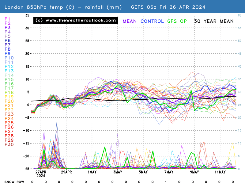
Based on various runs of the GFS (Global Forecast System) model from the NOAA in the USA, the ensembles show various possibilities of what might happen to the weather over the next two weeks.
The top lines (and the left-hand scale) indicate temperature, the bottom lines (and the right-hand scale) precipitation. The red temperature line indicates the average for the time of year and the thick green line the main "operational" run.
The ensembles should be taken as a general indicator of trends, rather than a definitive forecast of whether it's going to rain on your parade next Tuesday afternoon. The more agreement between runs (ie the closer the lines) the more likely the forecast is to be correct, though of course the runs can all be wrong.
Note that the temperature is at 850 hPa thickness - most easily understood as the air up in the sky rather than at ground level. Ground level temperatures are typically 5-10C higher.
The GFS ensembles are updated 4 times a day, around midnight, 0600, 1200 and 1800 GMT.
The "operational" run, of the GFS (Global Forecast System) from the NOAA in the USA, as described in the ensembles section. This app includes daily charts out to two weeks, showing atmospheric thickness and temperature.
The GFS model is updated 4 times a day, from 0330, 0930, 1530 and 2130 GMT.
The forecast model from the European Centre for Medium-Range Weather Forecasts is one of Europe's most respected. Funded by 31 European states, the organisation is based in Reading. The charts in this app show pressure and 500 hPa thicknesses as forecast for the next 10 days.
The ECM charts are updated twice a day: at 1000 and 2300 GMT
The ECM ensembles are in a different format to the GFS ones, giving the predictions of various runs on ground temperature, dewpoint, precipitation, wind, gusts and cloud cover in separate graphs. The first two graphs are for temperature and cumulative precipitation on the ground in London. On these the overlaid blue line represents the GFS model (called the NCEP here). The subsequent forecasts are for the Netherlands, but are still useful as a guide to trends and forecast confidence.
The raw output of the computer model of the UK Met Office. As with the ECM charts, they show pressure systems and 500 hPa thicknesses as forecast for the next 10 days.
Uniquely among charts in this app, these are created by human beings, at the UK Met Office. Though heavily informed by computer models, meteorologists can also use their judgement and override the automatically generated output to produce these predictions. Different charts are updated at different points through the day.
The Met Office's text forecast interprets what the weather models mean for the weather on the ground in the UK.
This app was created by Julius Honnor using weather charts from www.wetterzentrale.de and jQTouch, a jQuery plugin for mobile web development on the iPhone.
© www.juliushonnor.com 2010-2013
The charts in this app are mostly from www.wetterzentrale.de, a German site that has an enormous selection of charts.
uk.sci.weather is the original UK web discussion group.